I just want to start by saying that what happened in France on November 13, 2015 is a tragedy. My heart goes out to all of the victims and their loved ones.
During one of my rare Facebook-browsing sessions, I noticed that a bunch of my friends had a flag of France overlay on their profile pictures. I know this is a feature that Facebook will show in your news feed that allows you to simply click a button to apply the overlay (I’ve done it before for the Mets…didn’t turn out too well). I looked all over and couldn’t find a way to do it for my own profile picture. Frustrated, I resorted to creating my own…
I loaded up MS Paint – the best computer graphics program in the whole world – to make some shitty version of my own France Facebook profile picture. After all, French is the highest proportion of heritage in me (contrary to popular belief, Irish is not first, but it is a close second). Then this got me all thinking about my own personal background and where my relatives are from. To the best of my knowledge, I believe I’m 3/8 French, 2/8 Irish, 1/8 German, 1/8 Dutch, and 1/8 Belgian.
So then I thought, “What’s cooler than putting numbers into a chart?” Answer: Nothing! Charts are awesome. So I opened up Excel, entered in my data, and made this cool chart to showcase my heritage:
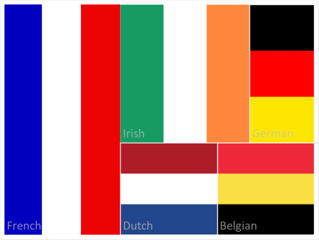
This chart is called a treemap and I love it! I inserted flags as fills for the cells to give it more of a visual representation. It’s amazing how much you can do in Excel when you have simple data.
Anyway, where was I going with this? Oh yea! My Facebook profile picture…well I made one of those too as a sunburst chart:

This one’s quite impossible to give accurate estimations of the relative proportions. To be honest, both charts are. If I was trying to present the data for numerical accuracy, I would have used a bar chart since the human brain is much better at determining relative proportions of lines than areas. But, these charts are more fun…and colorful!
