It’s 11:35 p.m. and I’ve spent the past several hours trying to fumble my way through Tableau for the first time, so I’m not here to make some witty opening paragraph. The fumbling was so worth it, though, because Tableau seems like an incredible data visualization software tool and I can’t wait to get deeper into it.
As part of a course I’m taking on Coursera called Data Visualization and Communication with Tableau, I was provided with a database of government records for all visa sponsorship applications by U.S. companies for foreigners into the U.S. Any company wishing to hire a non-U.S. citizen must get the approval from the government for a green card or work visa (I did not know that).
Some patient soul working with Coursera meticulously went through every job title on the applications and placed them into one of eight general job titles: assistant professor, attorney, business analyst, data analyst, data scientist, management consultant, software engineer, teacher.
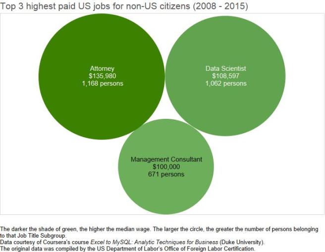
So it looks like attorneys are the highest paid foreign workers. Another interesting fact: companies have to state how much they are planning on paying the employee every time they submit a visa or green card application. They also have to state the average amount an employee with similar skills and background typically gets paid for the same position, a figure called “the prevailing wage.” So chances are that foreign workers are making close to what U.S. workers are (maybe I should have gone to law school after all…). Each of these job title above has around 1,000 persons working in that position, which doesn’t seem like a whole bunch. Let’s add the 4th highest paying position:
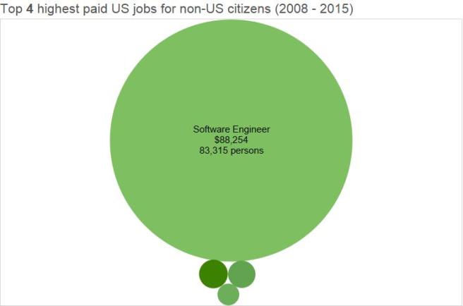
WHA-BAM, as Aziz Ansari would say. The amount of foreign Software Engineers dwarfs the top 3 highest paid positions. It reminds me of looking at a visualization of our solar system and you’re thinking to yourself, “Oh cool….Mercury…Venus…oh there’s Earth…Mars is really red…WHAT IS THAT THING”. It’s Jupiter. Software Engineer is the Jupiter of the foreign workers’ solar system.
Now let’s put them all together for some more perspective: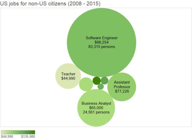
Software Engineers rule supreme, but you see that there are other titles that aren’t as exclusive as the top 3. That one little guy next to the top 3 is “Data Analyst,” which is a title I’d love to have in the very very near future.
Finally, here’s a nice bar chart that makes everything a lot more accurate to compare, but are not as fun to look at or make: